

#UX #UI #E-COMMERCE #RESPONSIVE WEB DESIGN
Experience
Japanese Culture
Making an intuitive subscription shopping experience.
Introduction
Bokksu is a D2C E-commerce company in New York that delivers Japanese snack subscriptions worldwide.
They needed a new & more efficient website to replace the old one. The previous website had several technical problems. Also, the company holds old information about target users, and they are questioning how to approach the right users.
We decided to conduct user research and develop an appealing and functional website requiring less maintenance, being more intuitive to every customer, and increasing user trust.

Overview
Problem
The slow platform speed, poor accessibility of the website, and difficulties with the user account page, including controlling subscription status, were significant issues for Bokksu that resulted in a high drop-off rate.
Outcome
We successfully launched a new website in 3 months that met the business goals. We successfully increased the conversion rate by 20% over 2022 and improved site speed to under 3 seconds.


My role
I worked with Product Team to find problems in user interviews. Then, to solve the problem, I designed it in Figma, worked with the product manager and engineers to ship the new branding website, and worked with QA for testing.
Team
Mieko Kawasaki (Product Designer)
Dan Joo ( Project Manager)
Usman Khan (Principal Software Engineer)
Jacqueline Jones (Senior Engineer)
Asma Zafar (QA Engineer)
Faizan Ahmed (Software Engineer)
Company
Bokksu
Industry
E-commerce
Timeline
3 months (pre-release), Ongoing
Process
Discover
We surveyed 971 active subscribers and unsubscribers and invited 30 people to 1:1 user interviews.
Define
I synthesized the qualitative and quantitative data from the research data to find key insights and developed three personas for Bokksu Snack Box.
Design
Based on the data, I designed a solution in Figma, brainstormed ideas, and exchanged feedback with the product manager and creative team.
Develop
I worked with engineers and QA to develop a new website to achieve a tight deadline. I try to communicate clearly and deliver my request.

Function
The most significant problem was that the platform's speed was 12 sec, which frustrated users and also discovered the high drop-off rate.

Usability
Finding information was challenging, especially on the user account page. Controlling the subscription status on the account page is crucial in the subscription business.

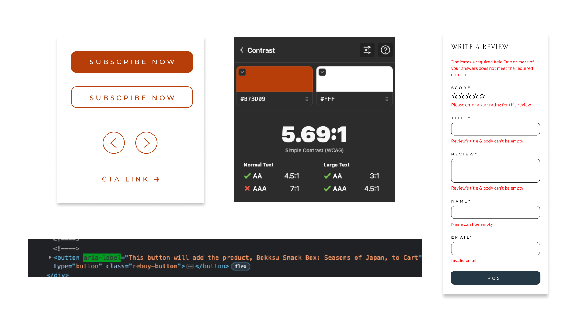
Accessibility
The original Bokksu site had accessibility issues, such as poor color contrast, small text, insufficient support for the error message, and no support for keyboard readers.
Problem

She loves subscriptions product and also loves shopping.
She loves recommending her favorite product to her friends’ circle.
Refer influencers on YouTube/ Instagram.
Snack Habit: Always share with friends and tell them how I love Bokksu.
“I found Bokksu through my favorite Youtuber, but the website is challenging to navigate because I have low vision, and sometimes need help to read small or low-contrast typography”
Sarah
Age: 37
Profession: Attorney
Location: Philadelphia, PA

He tried other Japanese subscriptions but chose Bokksu.
Opening the Bokksu box is a monthly event for us.
His family is from Japan, and he wants to introduce culture to his kids.
Snack Habit: Sharing with kids, he is a more enjoyable reading guide.
“I am excited to open Bokksu with my kids every month! I have subscribed to Bokksu for five years, but pausing my subscription on the account page is always challenging.”
Alex
Age: 41
Profession: Proffesor
Location: Tampa, FL
Who loves Bokksu?


Our hypothesis
Designing an intuitive membership system and shopping experience with an accessible interface and straightforward navigation will reduce frustration and increase users' trust in the Bokksu brand.
Solution
I designed an innovative Bokksu website that effectively addresses user and business issues. With a shared focus on simplicity, engineers and I worked tirelessly to craft a seamless solution ready for launch.
Accessible to anyone
Lack of web accessibility is missing opportunities to engage with users with a disability, such as color blind or just poor eyesight users. If we fix this design, they can access Bokksu, and Bokksu will tap a new market.
Resize font size
Rearrange color contrast
Make all functionality available from a keyboard
Help users avoid and correct mistakes
Provide text alternatives for any non-text content
Easy to use
We developed an intuitive design account page to enhance the user experience for Bokksu users. This is the beginning, so we keep iterating and adjusting based on user feedback to create a better account page.
All necessary information on Account Home Page
Single Sign On
Replace the delay 1-month function
New menu style
Ease of editing personal information

Scalable for future
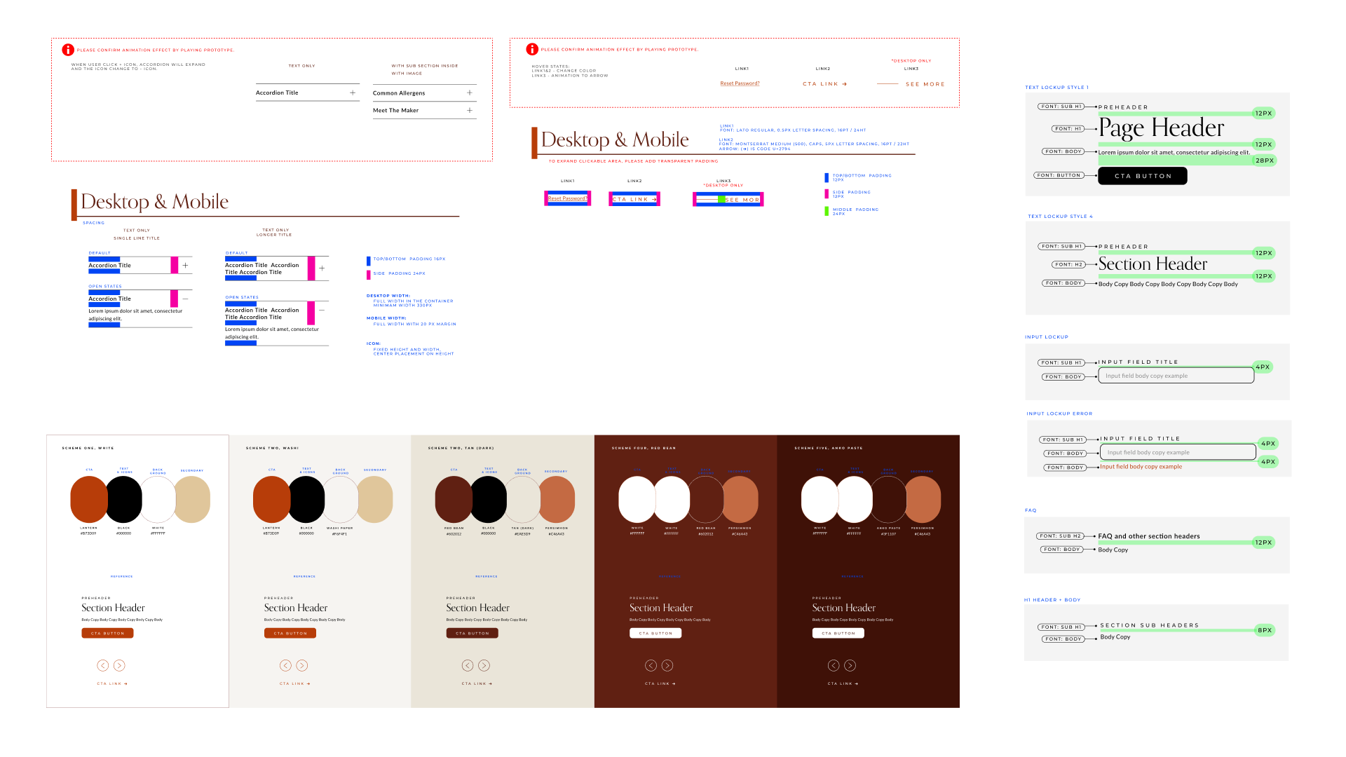
I built the company’s first design system. I believe it needs to be simple and scalable for future use by anyone in the company. So I try to be straightforward so that system is easy to understand with non-designers.
New typography with a clear hierarchy
Set a rule for each component in the library
Cleaning up the font system in the backend
Non-designer to choose from the color scheme
Create a module in the no-code landing page maker

Result
The conversion rate increased by 20% over 2022, 56% during the holiday season.
We successfully increased site speed to under 3 seconds from 12 seconds.


Next Step
My goal is to bring the Bokksu website to meet Level AAA quality in WCAG 2.1. We need to conduct more user testing with disabled users and get real feedback.
Adding more functions to the royal member to feel satisfied to stay continue as Bokksu member and increase lifetime value.