
#UX #UI #VISUAL DESIGN #RESPONSIVE WEB DESIGN
#STOPASIANHATE
By increasing
the voting rate
Redesigning UI/Visual for a non-profit organization

Old Design

New Design
Introduction
8BY8 website needs a new design that attracts its target users.
8BY8 is a non-profit organization in San Fransisco, CA. Its mission is to empower Asian Americans today to use their political voice to stop Asian hate.
They discover that Asian Americans, significantly younger voters, are among the lowest voter turnouts in the United States. Meanwhile, anti-Asian hate crimes spiked 150% in 2020. So they created a website to support increasing voting rates.
Duration
On going
Client project,
August 2021
Client
8BY8
My Role
I led the UI and Visual design, incorporating user research data and business requirements.
Tool
Figma
Ipad & Apple pencil
Illustrator
Photoshop
Method
UI Design & Visual Design
Typography
Logo Design
Design System
Style Guide
Problem
What do 8BY8 users think about old design?
We conducted user interviews with 10 target users (under 30 AAPI citizens) and discovered that the 1st prototype does not appear for them.
8BY8 Challenge starts from SNS sharing, so it is crucial to attracting target users.
Key pain points in the old design

Color and font
Users think the color is outdated. Also, the font is a difficult read. This is because there are too many words on each screen and used decorative font for the header.

Clutter visual
Users think the restaurant logo image and layout look like an advertisement. So it seems not trustworthy to click.
Design Process
Designing with data
I built a design system for 8BY8, including Logo, color, typography, and all UI components on the Figma file. In addition, I worked with stakeholders to contain business-side requirements and provided the below solutions.
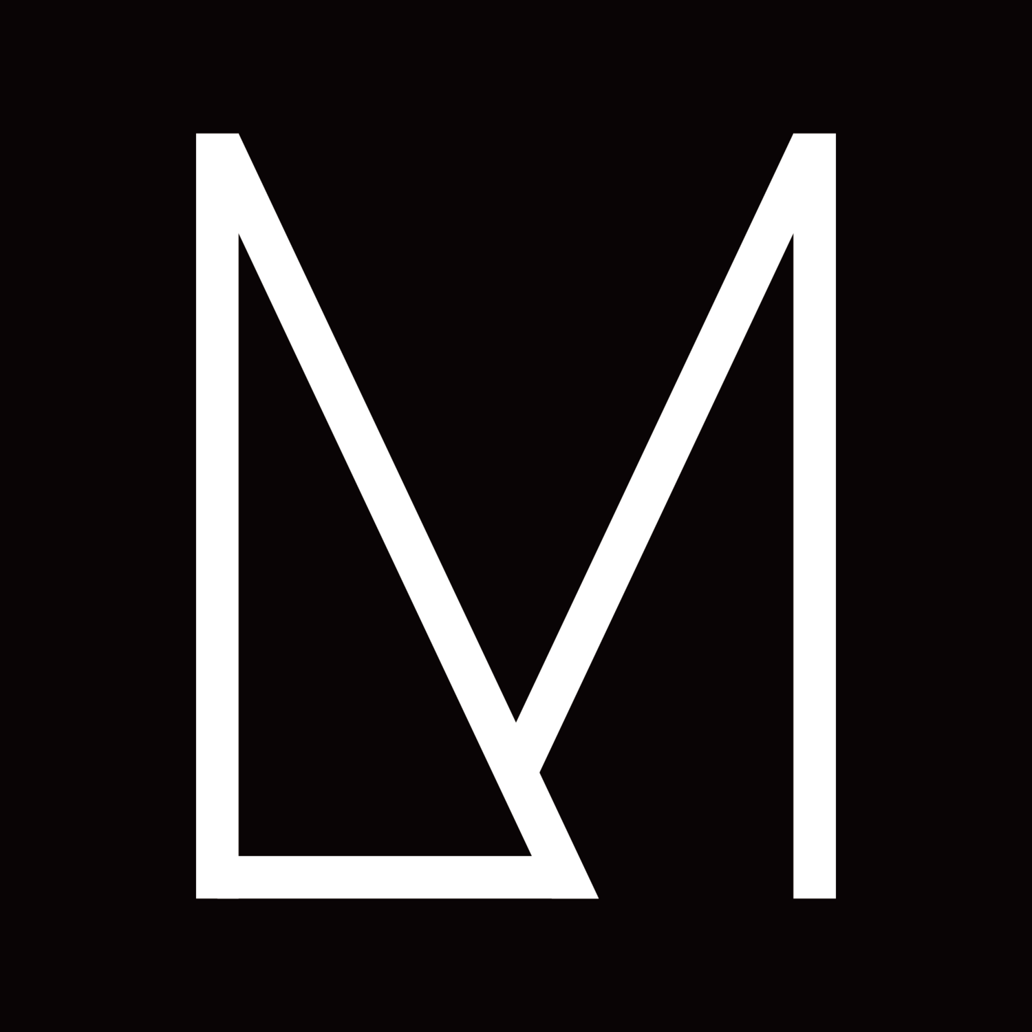
Logo
The 8BY8 new Logo brings a clear message to users about the 8BY8 Challenge, "8 people in 8 days".
8 is very graphical, so I wanted to use it as a shape and try to be minimal as possible. Because there are so many sentences on this website, so Logo should be clean to stand out.

Color
Black with accent colors of Yellow makes a substantial impact on the user's eyes. Especially combination of industrial and brutalism touch of design makes the slogan stand out and visually appear modern. This impact color combination will bring 8BY8's mission to users.

Typography
8BY8 is a unique website and Challenge, so they cannot eliminate sentences. So I proposed changing the typography to be simple, easy to read and using it as part of the design. The header font is capitalized only, and bold San serif helps the 8BY8 message to stand out. The body font "Lato" is excellent readability and keeps a modern feeling for the new website.

Web Accessibility
I found the original UI and visual design were poor Web Accessibility. So I added the color rule to help us follow it and get enough contrast on each screen.

Friendly illustrations
I draw an illustration for 8BY8 to add a more accessible feel for young users. We heard much hesitance to be involved 8BY8 Challenge in user interviews because they think politics is too complicated. But once they tried the registration process on 8BY8, they described it as "easy as online shopping!".
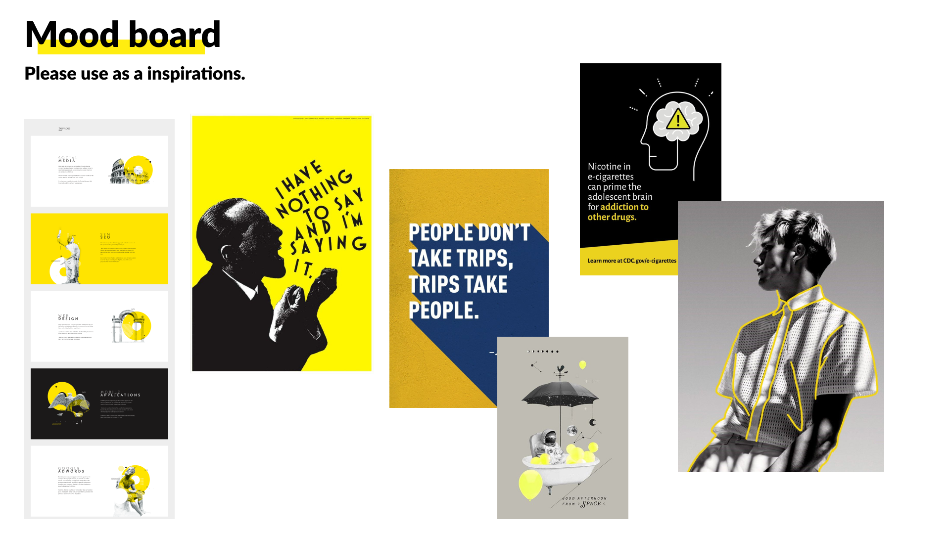
Mood board

Sample graphic for Instagram post

Design ideas for instagram post
Design System
When I design these components, I consider meeting WCAG 2.1 requirements to create better Web Accessibility.
Interaction Design
-
![]()
Form
I added notification messages and icons to notify the user when an error occurred.
-
![]()
Multiple Avatar
I added the black line for the selected avatar to solve the poor color contrast between white and yellow.
-
![]()
Button
To keep a bold brand feel, I chose a plain rectangle with bold fond to show a sharp and minimal atmosphere.
-
![]()
Challenge Badge
I added a little avatar icon to add a more personalized feel.


Prototype


Result
Improved user satisfaction by 30%.
More than 90% of users answered they were interested in voting through the 8BY8 Challenge.